


🇧🇷
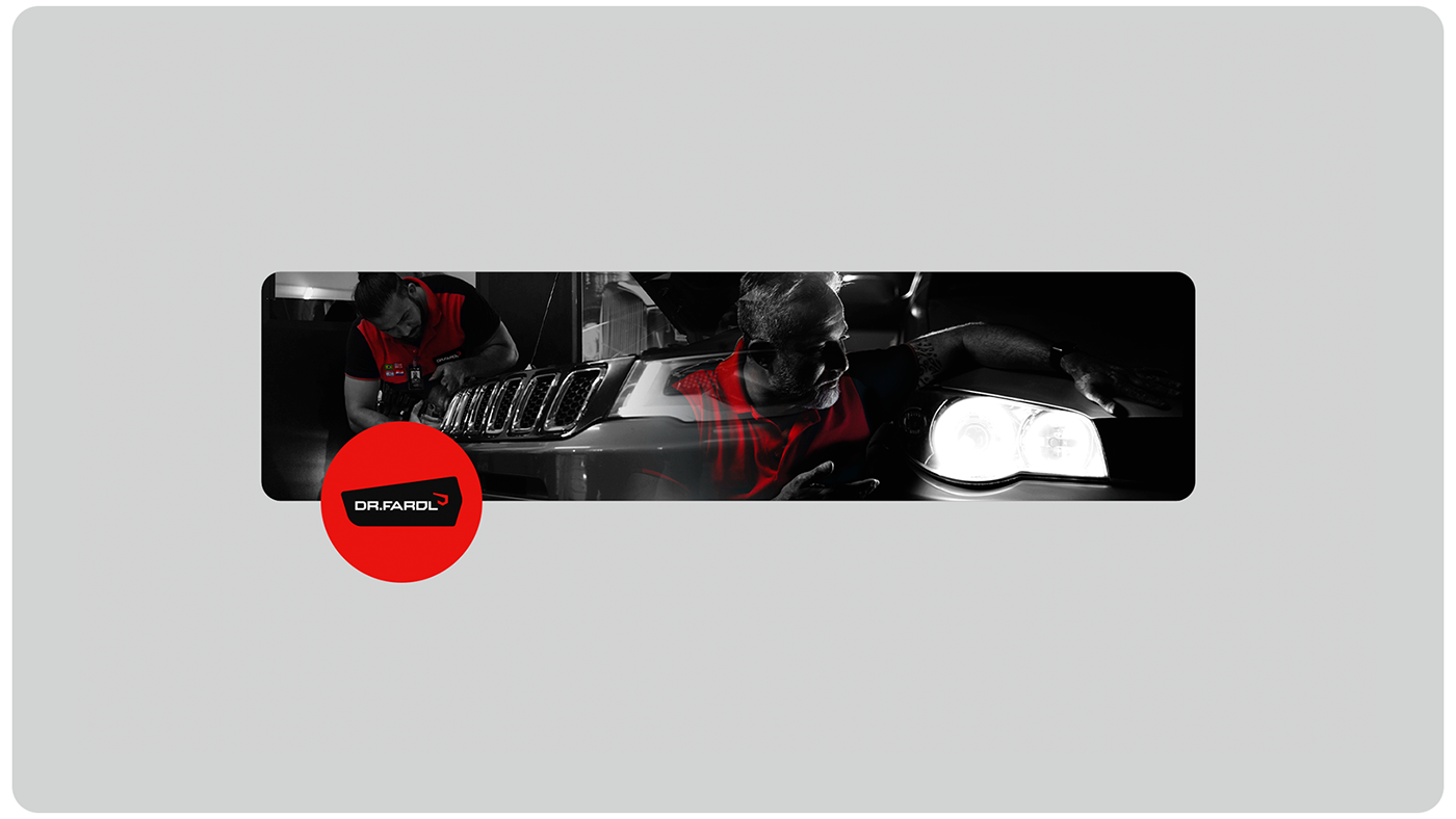
A Dr. Farol é uma oficina automotiva mundial especializada em consertos, manutenção e personalização de faróis, lanternas e iluminação interna e externa de veículos. A empresa se destaca por oferecer soluções especializadas nessa área, sendo reconhecida como os maiores especialistas no ramo no Brasil e até mesmo fora dele. A equipe da Dr. Farol se compromete com a constante busca por novidades, inovação e aprimoramento, sempre garantindo serviços de alta qualidade.
O nome "Dr. Farol" foi escolhido devido ao principal foco da empresa: consertos e manutenção de faróis de veículos. O nome "Dr." remete à ideia de cuidado, expertise e solução, assim como um médico que busca melhorar a saúde de seus pacientes.
🇺🇸
Dr. Farol stands out as the leading specialist in Brazil and beyond, offering specialised solutions in this area. For this reason, its visual identity is more than just a graphic representation; it is the materialisation of its passion for improving automotive lighting.
Every detail has been carefully crafted to convey our relentless pursuit of excellence and leadership in the sector. From the strategically selected colour palette, which symbolises passion, energy, sophistication and stability, to the modern typography, which combines technical expertise with innovation, Dr.Farol's new visual identity is an authentic reflection of what it stands for.

🇧🇷
Um dos maiores desafios desse projeto foi trilhar o caminho de transformar uma visão compartilhada em uma identidade visual tangível. Para a Dr. Farol, não é apenas sobre carros, mas sim de relacionamentos e conexões. Então cada detalhe do design precisava transmitir a paixão e dedicação que a marca nutre por seus clientes e colaboradores. Além disso a marca já possuía essa definição sólida de valores. Porém, o que faltava era uma identidade visual que refletisse plenamente esses valores e transmitisse a mensagem precisa e poderosa que a marca carrega consigo.
🇺🇸
One of the biggest challenges of this project was the path of transforming a shared vision into a tangible visual identity. For Dr Farol, it's not just about cars, it's about relationships and connections. So every detail of the design needed to convey the passion and dedication that
the brand harbours for its clients and collaborators. And the brand already had this solid definition of values. What was missing, however, was a visual identity that fully reflected these values and conveyed the precise and powerful message that the brand carries with it.
the brand harbours for its clients and collaborators. And the brand already had this solid definition of values. What was missing, however, was a visual identity that fully reflected these values and conveyed the precise and powerful message that the brand carries with it.

🇧🇷
Para a paleta de cores da marca da Dr. Farol, tomamos decisões estratégicas para manter a essência e a história da empresa. O vermelho permanece como a cor principal, pois ele é mais do que apenas uma cor; é parte da história da Dr. Farol. O vermelho representa paixão, energia e o compromisso inabalável da empresa com a excelência. Além disso, essa cor já estava presente na marca anterior, criando uma ligação sólida com a história da empresa.
Para criar a tipografia da Dr. Farol, nos inspiramos nos detalhes dos faróis de veículos modernos, identificando um elemento marcante: o corte nos cantos dos faróis, que transmite uma estética única. Decidimos incorporar esse detalhe em nossa tipografia, visível no 'O' da palavra 'Dr. Farol'. A fonte moderna escolhida reflete nossa busca constante por tecnologia de ponta e nossa visão de liderança na iluminação automotiva.
🇺🇸
For the color palette of the Dr. Farol brand, we made strategic decisions to maintain the essence and history of the company. Red remains the main color, as it is more than just a color; it is part of the Dr. Farol story. Red represents passion, energy and the company's unwavering commitment to excellence. In addition, this color was already present in the previous brand, creating a solid link with the company's history.
To create Dr. Farol's typography, we were inspired by the details of modern vehicle headlights, identifying a striking element: the cut in the corners of the headlights, which conveys a unique aesthetic. We decided to incorporate this detail into our typography, visible in the 'O' of the word 'Dr. Farol'. The modern font chosen reflects our constant search for cutting-edge technology and our vision of leadership in automotive lighting.


🇧🇷
Com o resultado da tipografia, percebemos que havia uma oportunidade de trazer algo ainda mais especial e autêntico para a identidade visual.
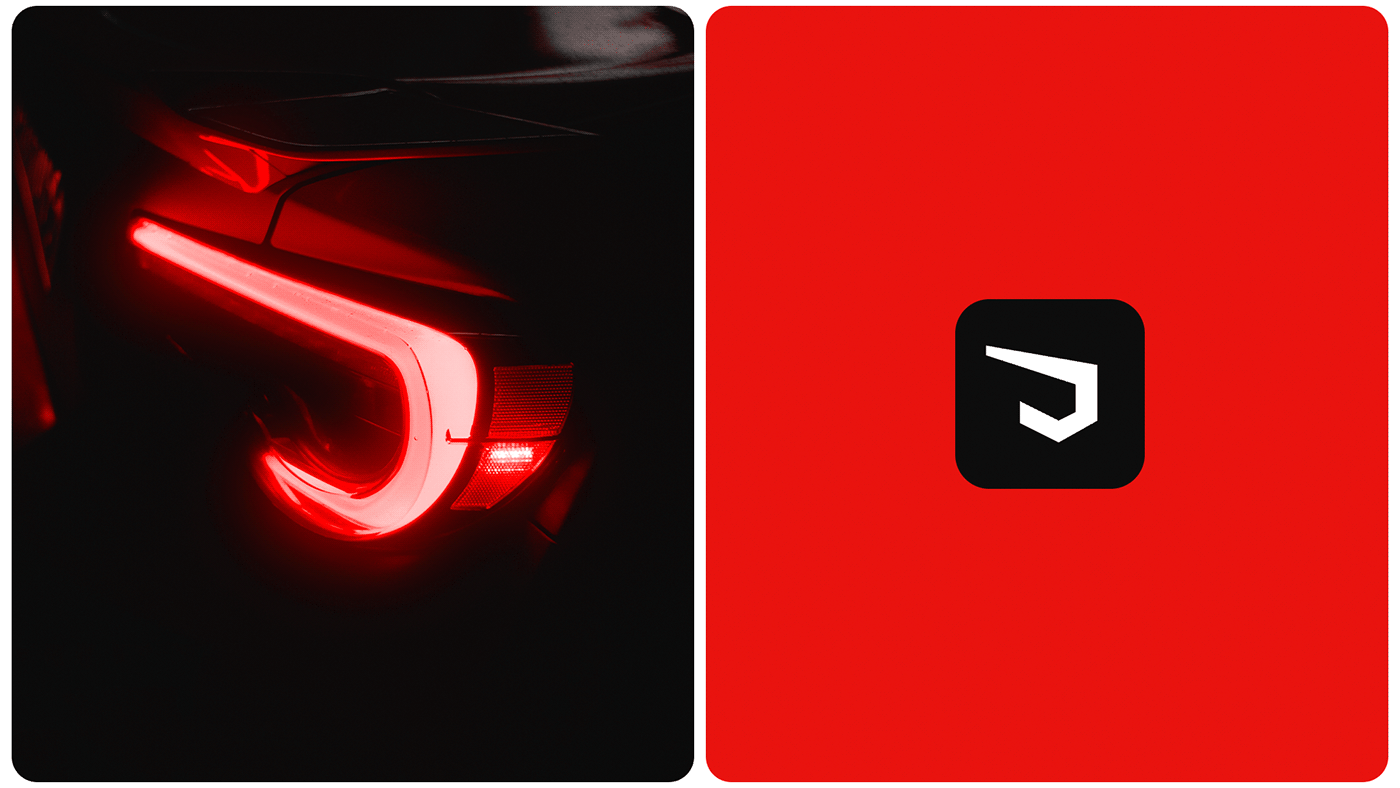
Por isso decisimos trabalhos no desenvolvimento de um simbolo complementar. Nossa principal inspiração foi o farol do carro Toyota FT GT 86. Este farol moderno, com linhas elegantes e forma distinta, capturou nossa atenção e acendeu a faísca criativa para o desenvolvimento do nosso símbolo.
Assim nasceu o símbolo – uma marca que não apenas lembra a forma distintiva de um farol, mas também incorpora um toque de proteção e confiança.
🇺🇸
With the result of the typography, we realised that there was an opportunity to bring something even more special and authentic to the visual identity.
That's why we decided to work on developing a complementary symbol. Our main inspiration was the headlight of the Toyota FT GT 86 car. This modern headlight, with its sleek lines and distinctive shape, captured our attention and ignited the creative spark for the development of our symbol.
Thus the symbol was born - a mark that not only recalls the distinctive shape of a lighthouse, but also incorporates a touch of protection and trust.

🇧🇷
Quando o logotipo tipográfico e o símbolo se unem, uma nova dimensão de significado é criada. Essa combinação representa um equilíbrio perfeito entre autenticidade e modernidade, entre conhecimento técnico e inovação. O logotipo tipográfico incorpora a tipografia exclusiva que desenvolvemos, refletindo nossa busca constante por excelência e nossa conexão intrínseca com a indústria de iluminação automotiva.
Buscando proporcionar ainda mais oportunidades e versatilidade, decidimos criar uma versão alternativa do logo. Essa versão pode ser usada em aplicações em que desejamos chamar a atenção de forma especial. Ela apresenta um fundo em formato de farol, formato predominante encontrado na maioria dos faróis. Essa escolha não apenas reforça nossa identidade, mas também se destaca em aplicações visuais, garantindo que nossa marca seja reconhecida instantaneamente.
🇺🇸
When the typographic logo and symbol come together, a new dimension of meaning is created. This combination represents a perfect balance between authenticity and modernity, between technical expertise and innovation. The typographic logo incorporates the unique typeface we have developed, reflecting our constant quest for excellence and our intrinsic connection with the automotive lighting industry.
Seeking to provide even more opportunities and versatility, we decided to create an alternative version of the logo. This version can be used in applications where we want to attract special attention. It features a background in the shape of a headlight, the predominant shape found on most headlights. This choice not only reinforces our identity, but also stands out in visual applications, ensuring that our brand is instantly recognisable.


🇧🇷
A Dr. Farol se destaca como a maior especialista no Brasil e além das fronteiras, oferecendo soluções especializadas nessa área. Por isso, sua identidade visual é mais do que uma simples representação gráfica; é a materialização de sua paixão por aprimorar a iluminação automotiva.
Cada detalhe foi cuidadosamente trabalhado para transmitir nossa busca incessante por excelência e liderança no setor. Desde a paleta de cores estrategicamente selecionada, que simboliza paixão, energia, sofisticação e estabilidade, até a tipografia moderna, que combina expertise técnico com inovação, a nova identidade visual da Dr.Farol é um reflexo autêntico do que ela representa.
🇺🇸
Dr. Farol stands out as the leading specialist in Brazil and beyond, offering specialised solutions in this area. For this reason, its visual identity is more than just a graphic representation; it is the materialisation of its passion for improving automotive lighting.
Every detail has been carefully crafted to convey our relentless pursuit of excellence and leadership in the sector. From the strategically selected colour palette, which symbolises passion, energy, sophistication and stability, to the modern typography, which combines technical expertise with innovation, Dr.Farol's new visual identity is an authentic reflection of what it stands for.


🇧🇷
Cada elemento - da paleta de cores à tipografia e ao logo - é cuidadosamente harmonizado para contar uma história unificada. A paleta de cores transmite emoção e profissionalismo, enquanto a tipografia não é apenas uma fonte, mas uma narrativa visual que se relaciona com a indústria. O logo, em sua forma única, personifica nossa busca constante por equilíbrio entre autenticidade e modernidade.
A nova identidade visual da Dr. Farol é uma materialização de nossa paixão, expertise e visão. É uma promessa aos nossos clientes de que, quando escolhem a Dr. Farol, estão escolhendo o melhor em iluminação automotiva.
🇺🇸
Every element - from the colour palette to the typography and logo - is carefully harmonised to tell a unified story. The colour palette conveys emotion and professionalism, while the typography is not just a font, but a visual narrative that relates to the industry. The logo, in its unique form, embodies our constant search for a balance between authenticity and modernity.
Dr. Farol's new visual identity is a materialisation of our passion, expertise and vision. It is a promise to our customers that when they choose Dr Farol, they are choosing the best in automotive lighting.


